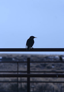
photo 1:
Taken in Lander, WY.
-ISO400, f/3.5, 1/4sec
-Increased clarity, contrast and vibrancy
-brought down the darks and shadows on the tone curve, and brought the highlights up a little just to make the outside world pop a little more.
-sharpened a little to bring just a bit more detail forward
-added a vignette because the left side of frame was a little darker. Wanted to even it out little more
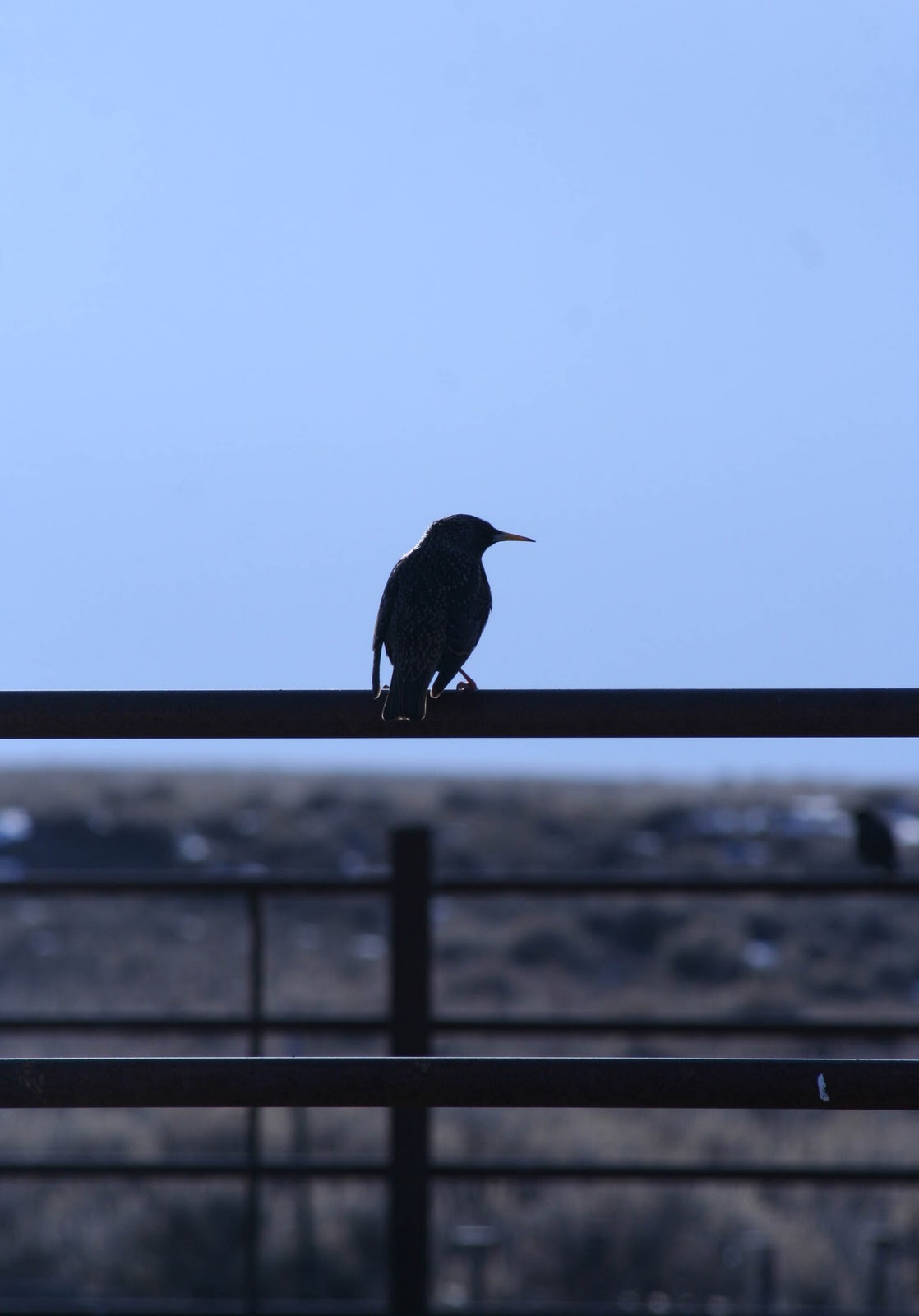
photo 2:
Taken just outside of Lander.
-ISO400, f/6.3, 1/3200sec
-cropped it on the sides to get rid of a few spots in the snow, and down on the top get the fence out as well
-boosted the contrast
-brought the darks and shadows down to get a little more dynamic against the snow background.
photo 3:
Taken in Arches National Park
-ISO100, f/6.3, 1/80sec
-graduated filter on top to dim the light up a little
-graduated filter on bottom to light him up more
-brought up contrast and vibrancy to make him pop a little more
-dropped the darks and shadows down to add just a little more to him, make sure your focus starts on him
Photo 4:
Taken in Arches National Park
-ISO100, f/8.0, 1/200sec
-played with tone curve, to bring more intensity to the scene and not so bland, desert like
-intensified the saturation of some of the colors like the orange and green to get a little more contrast in colors
photo 5:
Taken in Arches National Park
-ISO100, f/10, 1/250sec
-again, adjusted the tone curve, basically the same as others
-brought exposure and fill light up a little to bright the arch up
-brought up highlight recovery to get a little more detail in the background through the clouds
-brought up the saturations on some of the colors like the blue and orange
photo 6:
Taken in Arches National Park
-ISO100, f/10, 1/250sec
-cropped top down to get rid of some sky, even it out a little
-boosted vibrancy and contrast to make it more intense
-spot removal in the sky on a couple spots
photo 7:
Taken at one of the highest points in devils garden-Arches National Park
-ISO100, f/11, 1/250sec
-warmed it up a little and boosted clarity
-graduated filter over sky to darken it up a little and get more mountain detail
-played with saturations of colors
-Tone curve, to make it pop
-added some contrast
photo 8:
Taken at Red Rocks Canyon
-ISO400, f/13, 1/400sec
-highlight recovery to get a little less reflection coming off her
-tone curve to make her pop out at you more
-saturated some colors, and sharpened a little
-cropped it down some to get rid of some background
-cloned a car off the road behind her head
photo 9:
Taken at Red Rocks Canyon
-ISO400, f/8.0, 1/320sec
-cropped it in on the sides
-boosted contrast
-played with the red, orange and yellow saturations
-sharpened it some
-added a fairly strong vignette to center him
photo 10:
Taken at Red Rocks Canyon
-ISO400, f/10, 1/400sec
-straighten the image some to get more vertical lines running through it
-dropped exposure a little to get less reflection off the rocks
-warmed up the temperature just a little
-played with tone curve
-messed with the saturation of the colors
-added a vignette. really works with the image
photo 11:
Taken in Zion National Park
-ISO100, f/8, 1/125sec
-converted image to black & white
-Cropped up the bottom just a little, and changed the angle little as well
-boosted the contrast and clarity some
-brought down the darks and shadow tones and brought up the highlights some to intensify the light of the sun a little more
photo 12:
Taken in Zion National Park
-ISO100, f/9, 1/160sec
-warmed it up a little, and boosted contrast
-played with the saturation of the orange, reds, yellows and greens
-played with tone curve
-added a small vignette
photo 13:
Taken at the top of Zion National Park
-ISO400, f/8, 1/640sec
-played with the saturation of the colors
-boosted contrast and clarity
-played with the tone curve
-dropped exposure just a little to get more detail in the sky
-reduced the noise some
photo 14:
Taken on BLM, while canyoneering
-ISO400, f/18, 1/125sec
-adjusted angle a little and cropped up bottom a little bit
-boosted clarity and vibrancy a little bit
-played with tone curve
-reduced the noise just a little
photo 15:
Taken in same spot
-ISO400 f/18, 1/100sec
-cropped in the sides and the top a little, and adjusted angle
-played with saturation of the colors
-boosted the contrast and clarity
-messed with the tone curve
-played with the luminance of the colors as well
-sharpened just a little
photo 16:
Taken in a slot canyon
-ISO200, f/5.6, 1/20sec
-boosted contrast and clarity a bit
-played with the tone, to get the shadows to stand out more
photo 17:
Taken in same area
-ISO100, f/10, 1/160sec
-played with saturation of colors
-boosted contrast some
-boosted clarity
-played with tone curve
photo 18:
Taken leaving Zion
-ISO100, f/6.3, 1/80sec
-boosted contrast, clarity, and vibrancy
-played with tone curve
-messed with the saturation and luminance of the colors
photo 19:
Taken on way to Snow Canyon State Park
-ISO100, f/5.6, 1/200sec
-boosted contrast
-played with saturation of colors
-dropped exposure just a little to get more of the mountains in the bckground
-played with the tone curve
-adjusted angle of image a little
photo 20:
Taken in Snow Canyon State Park
-ISO200, f/11, 1/500sec
-warmed it up a little
-boosted contrast, clarity and vibrancy
-played with saturation of the colors
-played with the tone curve
-dropped exposure a little
-adjusted angle of image a little
-added a vignette
photo 21:
Taken at the Grand Canyon
-ISO400, f/14, 1/400sec
-cropped left side to make tree frame image
-did a little spot removal
-played with saturation of colors a bit
photo 22:
Taken on ride home
-ISO400, f/4.5, 1/13sec
-adjusted angle some
-dropped exposure just a little
-added highlight recovery quite a bit
-boosted contrast, clarity and vibrancy a little
-played with tone curve
-added a small vignette
photo 23:
Taken at equestrian center
-ISO400, f/3.5, 1/50sec
-brought up exposure
-warmed it up some
-boosted contrast and clarity
-played with tone curve
-removed a little noise
photo 24:
Taken at equestrian center
-ISO400. f/3.5, 1/5sec
-boosted contrast, clarity, vibrancy
-played with tone curve
-boosted saturation a little
-added a small vignette
photo 25:
Taken at equestrian center
-ISO400, f/4. 1/6sec
-cropped right side in a little
-boosted clarity, vibrancy and contrast
-played with tone curve
-sharpened some
photo 26:
Taken at equestrian center
-ISO200, f/10, 1/500sec
-adjusted angle of image
-converted to black & white
-played with tone curve
-added graduated filter over sky to darken up just a little
photo 27:
Taken on the way to mystic lake
-ISO400, f/16, 1/640sec
-boosted contrast, clarity, and sharpening
-played with tone curve
-saturation and luminance of colors
photo 28:
Taken up in mystic lake area
-ISO200, f/11, 1/250sec
-converted to black & white
-boosted clarity
-played with tone curve
photo 29:
Taken in same spot
-ISO200, f/14, 1/400sec
-warmed it up a little
-boosted contrast, clarity, vibrancy and sharpening
-messed with the tone curve
-played with the saturation of colors
photo 30:
Taken in same spot
-ISO200, f/14, 1/320sec
-boosted contrast, clarity and sharpening
-played with tone curve
Tuesday, April 26, 2011
Monday, April 25, 2011


Tuesday, April 19, 2011
portrait 2-In color

This was taken in the afternoon, and the sun was coming from behind me, shining directly on her face. As you can see form the sky, there were very few clouds, so it was really bright out and the light was more direct instead dispersed for an overall brightness. The picture itself isn't that great of a portrait shot because of the background, so I added a vignet to it to try and bring the focus to her better. I like this picture though because if you know jill thats how she always is, so its more of a genuine photo and not so much a fake or posed shot. Again, the vignetting helps start the focus on her and not the background, and the background has a slight blur to it which helps as well. The sky is pretty prominent so your eye instantly wants to travel up from her face. Since the light is coming directly at her there's not really any shadows being cast other then from the hair in her face.
Wednesday, April 13, 2011
Portrait 1

I took this picture up at the equestrian center in the afternoon. The sun was setting off to the west, and I liked the sunlight coming into the side of her face more so than directly on her face. I think this helps show off more of what type of light I was using for the photograph. Obviously, you can see the light lighting up the right side of her face and her hair on that side. But it was such a clear bright day that there was also sunlight reflecting off a cars and other objects. You can see this because the left side of her face isn't completely shadowed; there's light reaching it. I tried to lighten up the eyes a bit, but she was squinting and she has dark eyes to begin with so it was pretty difficult. I also bumped up the contrast, clarity, and luminance of the noise reduction up a bit. I then used the spot removal tool to get rid of a few freckles that were standing out enough that they were bothering me. The last thing I did was cropped the bottom and the right side some to get rid of some unnecessary background, and make sure the attention is focused on the subject.
Wednesday, April 6, 2011
Portraits
This link is to BEL portraits. Their a photography business in the town where I'm from. Bernie is a super nice guy and I love his work, especially in the senior photos album. It's really interesting the different ideas in there. There's a pretty big variety in the photos and I like that a lot.
http://www.belportraits.com/Home.html
http://www.belportraits.com/Home.html
Wednesday, March 30, 2011
nature composition
http://photo.net/learn/nature/ghopkins/comp1/index
This article is about composition with nature photography. It talks about how the best way to improve composition skills is by learning how to see composition. Look for compositional elements in any photo. Ask yourself how they work together. Has these "composition maps" that were created for visual teaching aids.
This article is about composition with nature photography. It talks about how the best way to improve composition skills is by learning how to see composition. Look for compositional elements in any photo. Ask yourself how they work together. Has these "composition maps" that were created for visual teaching aids.
Action/Adventure


These are the photos I took for the action/adventure shoot. For the most part all the settings I changed were about the same for the photos. There were more but to many to choose from!
Tuesday, March 29, 2011
Composing with color
In the first article its basically an introduction to color and the basic elements. For instance it talks about the three variables of color which are hue, saturation and lightness. From playing with my own photos i've seen what these are but it was kind of nice to have them defined. It also talked about how the attitude of a photographer working with color contrasts greatly with the attitude of one working with black and white. I thought it was interesting to read how a photographer who likes to photograph in black and white goes about looking for shots. They make a significant effort to see the black and white tones in what their looking at to see like what shade of gray is this color going to be? or is this going to be black, is this going to be white? They have to try to search for those where as someone composing with color, though we do see in color there's a difference between what we see and what the camera sees, so they as well have to look at the scene and the elements that are in it.
In part 2 of composing with color it goes over controlling color in photoshop, color balance, and color palette. In photoshop your able to play with the three variables of color individually. In color balance you have to balance out the overall color. The goal of balancing is to get a neutral color truly neutral without a colorcast. The color palette is about selecting a range of colors that are going to be used in the photograph.
Part three is about working with saturation. It talks about how saturation is important but at the sane time its over used. Over using any of the 3 variables is not really good for your photograph either. Mentions that saturation is more of a problem with raw files, because their naturally desaturated, so we tend to oversaturate to get the color back in there. It explains global saturation Vs. local saturation. Global is saturation throughout the whole photo and local is saturation in a certain area of the photo.
In part 4 it starts out with talking about memorizing colors in the field. Basically in this part it goes over the other parts again but with photographs showing you the different ways saturation works and global vs. local saturation. A lot of repeat information.
Wednesday, March 23, 2011
Lightroom
I'm new to Adobe lightroom 3 and am still learning how to use a lot of the features. But now that i've been learning how to use it and learning more about photography i've been eager to take photos and play with them. Below are two copies of a picture I took out at the equestrian facility. A before and after photo. I'm pretty sure that when I took the picture I had the camera in the wrong settings, but I was getting into my car and saw the birds lined up in front of me, and the sun was nearly perfect, I just had to take some shots. But that's the great thing about lightroom 3! There are so many ways to change a photo. I think it's really cool to look at the original copy of your photo and then the final product, and just see the potential you found in that photo and brought the beauty out.
BEFORE:
 This is how the photo looked before I did anything to it.
AFTER:
 This is after I played with the saturation of the colors, the vibrancy, temperature, and a graduated filter on part of it. What I love most about this picture is the way the sun highlights the feathers on the bird, and the his head turned to the side so you get the full silhouette of the bird.
BEFORE:
AFTER:

Thursday, March 17, 2011
Composing with light
Reading these articles were interesting and very helpful. It helped me think of all the different elements of light and to think about with your pictures and what light to look for. In part 3 I really liked reading about the natural reflected light. To me those create the most stunning pictures. And the way natural light comes into your pictures changes all the time. Part 1 was also a really good one for information. It basically talked about how to find the best light for your photos, and knowing where the sun is in different times of the year. Reading that was interesting because i've never really given much thought to that. I liked the silhouettes in part 4 as well. In the right situation you can get some pretty neat shots. Of the photo examples he showed I liked the ones with the snow in them. I just really like winter photos. Overall, all the articles were interesting and helped me some way.
Friday, February 25, 2011
Lander, Wyoming
While on our way to northern Utah, our first stop to stay at for spring break, we were stranded in Lander, Wyoming due to a snow storm. So I took this opportunity to explore main street with my camera. Keep in mind that very little editing has been done to these three photos, if any at all. There may be a lot of distracting elements in the photos that may not need to be there, but I like them for I think they make the image, and is realistic. From the few shots I did get to take, I saw many others that I would love to capture as well. It would be nice to be able to stay here for a good full day to look around with all the fresh powder falling down.
 This is my favorite picture of the three. This was taken from the common room inside the hotel we stayed at. I really like how the reflections from the window played into this photo, and the glow from the inside lighting. The one thing don't like and think is too distracting is the clear reflection of the two lights at the top. I did no editing to this photo at all.
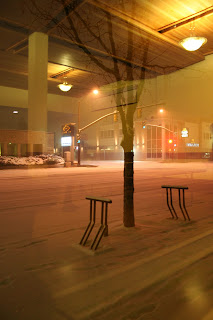
 I like this photo too, except that it does need to be lightened up. I'd really like the tree to be silhouetted, and the headlights of the cars toned down some. There's just so many photo opportunities around this small feel town, but so hard to capture in the snow and no proper lighting.
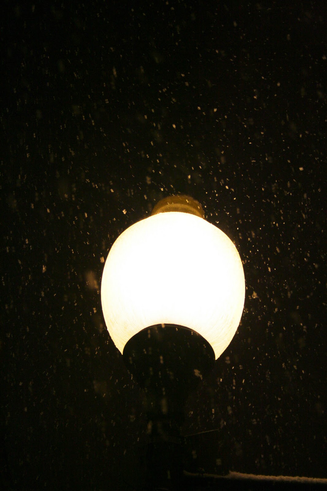
 I really like this one a lot as well. I'd probably play with the glow of the light a little bit to see how else it could look, and maybe crop the edges just a teeny bit. But I really like the reflection of the snow around the lamp.


Thursday, February 24, 2011
Adventure!
http://www.foundfolios.com/Benny-Haddad/Adventure/M/209?csk=29afe0c92314f806a9bd77779a0c7371-1
Benny Haddad has an interesting look on the different angles he takes of his photos. They just really intereste me.
Benny Haddad has an interesting look on the different angles he takes of his photos. They just really intereste me.
Wednesday, February 16, 2011
Black and white
I was looking at Chase Jarvis' Portfolio, and one of his albums is new zealand in Black and white, and I just love the way black and white looks. It's hard to capture the right images that look good in black and white. Sometimes the black and white element makes a picture stronger, and other times it can take away from the photo. I like simple, real moments in black and white the most, like his landscape photos below:
http://www.chasejarvis.com/#s=10&mi=2&pt=1&pi=10000&p=8&a=0&at=0
Photos 3, 6, 8, and 11 stuck out to me the most and made me pause to explore them more.
All of his photos albums on his portfolio are amazing and interesting to look at.
http://www.chasejarvis.com/#s=10&mi=2&pt=1&pi=10000&p=8&a=0&at=0
Photos 3, 6, 8, and 11 stuck out to me the most and made me pause to explore them more.
All of his photos albums on his portfolio are amazing and interesting to look at.
Thursday, February 10, 2011
Sports Photography
For our first photography project we did sports photography. I've never done any sports shooting before and I found out how hard it is to shoot action. In our group we chose basketball and the schools equestrian team. I wanted to do the equestrian team because not many people know we have one and I thought it'd be neat to do. When shooting over in the indoor arena I found out how difficult of a place that is to shoot in. Its really dark, and the lighting is weird in there. There's also a lot of dust particles floating around in the air so your flash tends to catch those in the image. I did have working with different angles to shoot. first I'd get up on the railing and shoot out over, trying to be up at the rider's level, maybe a little bit above. Then I went into the arena to get some straight on shots and lower level shots from down in the dirt. The difficulty I had with my photos is that first off, I'm not using dslr to take the photos so clarity is a big issue. Looking at the 3 photos below you'll see a lot of noise, but these are 3 my favorite that I ended putting in the slide show.


Wednesday, February 2, 2011
French's Point


(all photos taken from google) below is a link to their website for more images and history on french's point.
http://www.fpmaine.com
This is French's point in Stockton Springs, Maine. To me it's one of the most beautiful places to see in my hometown. There is a lot of history that goes along with this property, and I find it pretty neat that its a place I got to grow up around and even play at as a kid. In 2002 the property was sold to a family friend and her husband. In 2005 they began their big remodeling of it, turning it into a place of fairly tale weddings on the beautiful coast. My father did most of the landscape work around the property, which is something to be very proud of looking at it now. I also worked there over the summer, helping the owner keep up on the grounds work, and doing preparations for weddings. Above are a few photos after it has been remodeled. The night ones of a wedding event are my favorite. But they definitely do not do justice to the amazingness of the place. The truly beautiful places in the world can not be expressed well enough in a photo.
Subscribe to:
Posts (Atom)