In the first article its basically an introduction to color and the basic elements. For instance it talks about the three variables of color which are hue, saturation and lightness. From playing with my own photos i've seen what these are but it was kind of nice to have them defined. It also talked about how the attitude of a photographer working with color contrasts greatly with the attitude of one working with black and white. I thought it was interesting to read how a photographer who likes to photograph in black and white goes about looking for shots. They make a significant effort to see the black and white tones in what their looking at to see like what shade of gray is this color going to be? or is this going to be black, is this going to be white? They have to try to search for those where as someone composing with color, though we do see in color there's a difference between what we see and what the camera sees, so they as well have to look at the scene and the elements that are in it.
In part 2 of composing with color it goes over controlling color in photoshop, color balance, and color palette. In photoshop your able to play with the three variables of color individually. In color balance you have to balance out the overall color. The goal of balancing is to get a neutral color truly neutral without a colorcast. The color palette is about selecting a range of colors that are going to be used in the photograph.
Part three is about working with saturation. It talks about how saturation is important but at the sane time its over used. Over using any of the 3 variables is not really good for your photograph either. Mentions that saturation is more of a problem with raw files, because their naturally desaturated, so we tend to oversaturate to get the color back in there. It explains global saturation Vs. local saturation. Global is saturation throughout the whole photo and local is saturation in a certain area of the photo.
In part 4 it starts out with talking about memorizing colors in the field. Basically in this part it goes over the other parts again but with photographs showing you the different ways saturation works and global vs. local saturation. A lot of repeat information.
Tuesday, March 29, 2011
Wednesday, March 23, 2011
Lightroom
I'm new to Adobe lightroom 3 and am still learning how to use a lot of the features. But now that i've been learning how to use it and learning more about photography i've been eager to take photos and play with them. Below are two copies of a picture I took out at the equestrian facility. A before and after photo. I'm pretty sure that when I took the picture I had the camera in the wrong settings, but I was getting into my car and saw the birds lined up in front of me, and the sun was nearly perfect, I just had to take some shots. But that's the great thing about lightroom 3! There are so many ways to change a photo. I think it's really cool to look at the original copy of your photo and then the final product, and just see the potential you found in that photo and brought the beauty out.
BEFORE:
 This is how the photo looked before I did anything to it.
AFTER:
 This is after I played with the saturation of the colors, the vibrancy, temperature, and a graduated filter on part of it. What I love most about this picture is the way the sun highlights the feathers on the bird, and the his head turned to the side so you get the full silhouette of the bird.
BEFORE:

AFTER:

Thursday, March 17, 2011
Composing with light
Reading these articles were interesting and very helpful. It helped me think of all the different elements of light and to think about with your pictures and what light to look for. In part 3 I really liked reading about the natural reflected light. To me those create the most stunning pictures. And the way natural light comes into your pictures changes all the time. Part 1 was also a really good one for information. It basically talked about how to find the best light for your photos, and knowing where the sun is in different times of the year. Reading that was interesting because i've never really given much thought to that. I liked the silhouettes in part 4 as well. In the right situation you can get some pretty neat shots. Of the photo examples he showed I liked the ones with the snow in them. I just really like winter photos. Overall, all the articles were interesting and helped me some way.
Friday, February 25, 2011
Lander, Wyoming
While on our way to northern Utah, our first stop to stay at for spring break, we were stranded in Lander, Wyoming due to a snow storm. So I took this opportunity to explore main street with my camera. Keep in mind that very little editing has been done to these three photos, if any at all. There may be a lot of distracting elements in the photos that may not need to be there, but I like them for I think they make the image, and is realistic. From the few shots I did get to take, I saw many others that I would love to capture as well. It would be nice to be able to stay here for a good full day to look around with all the fresh powder falling down.
 This is my favorite picture of the three. This was taken from the common room inside the hotel we stayed at. I really like how the reflections from the window played into this photo, and the glow from the inside lighting. The one thing don't like and think is too distracting is the clear reflection of the two lights at the top. I did no editing to this photo at all.
 I like this photo too, except that it does need to be lightened up. I'd really like the tree to be silhouetted, and the headlights of the cars toned down some. There's just so many photo opportunities around this small feel town, but so hard to capture in the snow and no proper lighting.
 I really like this one a lot as well. I'd probably play with the glow of the light a little bit to see how else it could look, and maybe crop the edges just a teeny bit. But I really like the reflection of the snow around the lamp.


Thursday, February 24, 2011
Adventure!
http://www.foundfolios.com/Benny-Haddad/Adventure/M/209?csk=29afe0c92314f806a9bd77779a0c7371-1
Benny Haddad has an interesting look on the different angles he takes of his photos. They just really intereste me.
Benny Haddad has an interesting look on the different angles he takes of his photos. They just really intereste me.
Wednesday, February 16, 2011
Black and white
I was looking at Chase Jarvis' Portfolio, and one of his albums is new zealand in Black and white, and I just love the way black and white looks. It's hard to capture the right images that look good in black and white. Sometimes the black and white element makes a picture stronger, and other times it can take away from the photo. I like simple, real moments in black and white the most, like his landscape photos below:
http://www.chasejarvis.com/#s=10&mi=2&pt=1&pi=10000&p=8&a=0&at=0
Photos 3, 6, 8, and 11 stuck out to me the most and made me pause to explore them more.
All of his photos albums on his portfolio are amazing and interesting to look at.
http://www.chasejarvis.com/#s=10&mi=2&pt=1&pi=10000&p=8&a=0&at=0
Photos 3, 6, 8, and 11 stuck out to me the most and made me pause to explore them more.
All of his photos albums on his portfolio are amazing and interesting to look at.
Thursday, February 10, 2011
Sports Photography
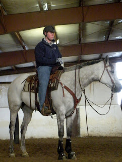
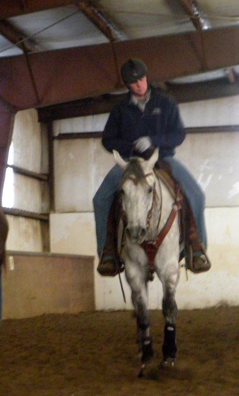
For our first photography project we did sports photography. I've never done any sports shooting before and I found out how hard it is to shoot action. In our group we chose basketball and the schools equestrian team. I wanted to do the equestrian team because not many people know we have one and I thought it'd be neat to do. When shooting over in the indoor arena I found out how difficult of a place that is to shoot in. Its really dark, and the lighting is weird in there. There's also a lot of dust particles floating around in the air so your flash tends to catch those in the image. I did have working with different angles to shoot. first I'd get up on the railing and shoot out over, trying to be up at the rider's level, maybe a little bit above. Then I went into the arena to get some straight on shots and lower level shots from down in the dirt. The difficulty I had with my photos is that first off, I'm not using dslr to take the photos so clarity is a big issue. Looking at the 3 photos below you'll see a lot of noise, but these are 3 my favorite that I ended putting in the slide show.


Subscribe to:
Posts (Atom)